

Øwhen
have only one data series.
Øwhen
the
total of something is known.
Øto
show
the pieces that make it up.
Øto
show
the percentage of total comparison.

BAR GRAPHS


RADAR

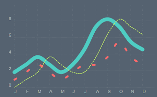
LINE CHARTS
-can
display continuous data over time.
-can
compare the data among years
-can
show
trends in a data at equal intervals.

BAR GRAPHS
qIt's easy to compare sets of
data
between different groups
at a glance.
qThe relationship of the data
between the x
and y axes is
easy to see.
qThey are effective in
presenting trends or
changes
over time.

AREA
CHART
qrepresent cumulated totals using
numbers or
percentages (stacked area
charts in this case) over time.
qfor showing trends over time among
related attributes.
qthe area
chart is like the plot chart
except that the area below the plotted line
is
filled in with colour
to indicate volume.
qwhen multiple
attributes are included,
the first attribute is plotted as a line with
colour fill followed by the second
attribute,
and so on.

RADAR
CHARTS
Øcompare between the best one to
choose.
Ø display multivariate observations
with an
arbitrary number of
variables.
Ødisplay the performance metrics of
any on going program
No comments:
Post a Comment